We rebuilt large parts of the Qovery Console: new navigation, overviews at every level, dark mode, and a modernized frontend architecture with TanStack Router and React Suspense.
The Console is one of the main ways developers and platform teams interact with Qovery, alongside the CLI, Terraform Provider, and MCP/Skills integrations.
Developer experience has always been a core focus for us, but over time, some parts of the Console became harder to navigate and maintain.
As the platform evolved and new capabilities such as Provision, Deploy, Observe, Secure, and Optimize were introduced, some parts of the Console became harder to navigate and maintain. Accessing something as simple as the health of an environment often required navigating through several pages and manually piecing information together. Navigation patterns were not always consistent, and some important platform areas lacked clear overview pages.
To address this, we rebuilt large parts of the Qovery Console to make the platform easier to navigate, easier to scale, and easier to evolve technically.
This redesign was both a UX and engineering project. Alongside a new navigation experience and improved overview pages, we also modernized parts of the front-end architecture to build stronger foundations for future improvements. We also took this opportunity to refine several workflows, components, and interactions across the product by integrating feedback collected from users over time.
The following sections cover the main UX changes, the technical decisions behind the redesign, and some of the lessons we learned during the project.
Why we rebuilt the console
Qovery evolved empirically. For years we added features as users needed them, shipped quickly, and let the product evolve in step with the team. That approach got us a long way, but we reached a point where every new addition made the platform harder to scale, and where the overall design consistency of the console was visibly dropping. The gaps in experience around different parts of the product were starting to compound.
When we dug into it, a few patterns kept coming up.
New features were getting harder to place in the product. Every new capability we added required finding a home for it in a navigation that had no obvious slot left. We could not keep shoehorning features into the existing structure without making the product less coherent. The result was that genuinely useful features were becoming harder to surface inside the product and harder for users to discover on their own.
The product was getting harder to use at scale. Getting a clear view of a project or environment often required navigating across multiple sections of the Console and piecing information together manually. The bigger the setup, the more painful the path.
We needed a new foundation. One that was future-proof enough to welcome the features still to come and the wave of new use cases emerging with AI, and that could grow without forcing the same compromises we kept hitting.
What we shipped
A redesigned navigation
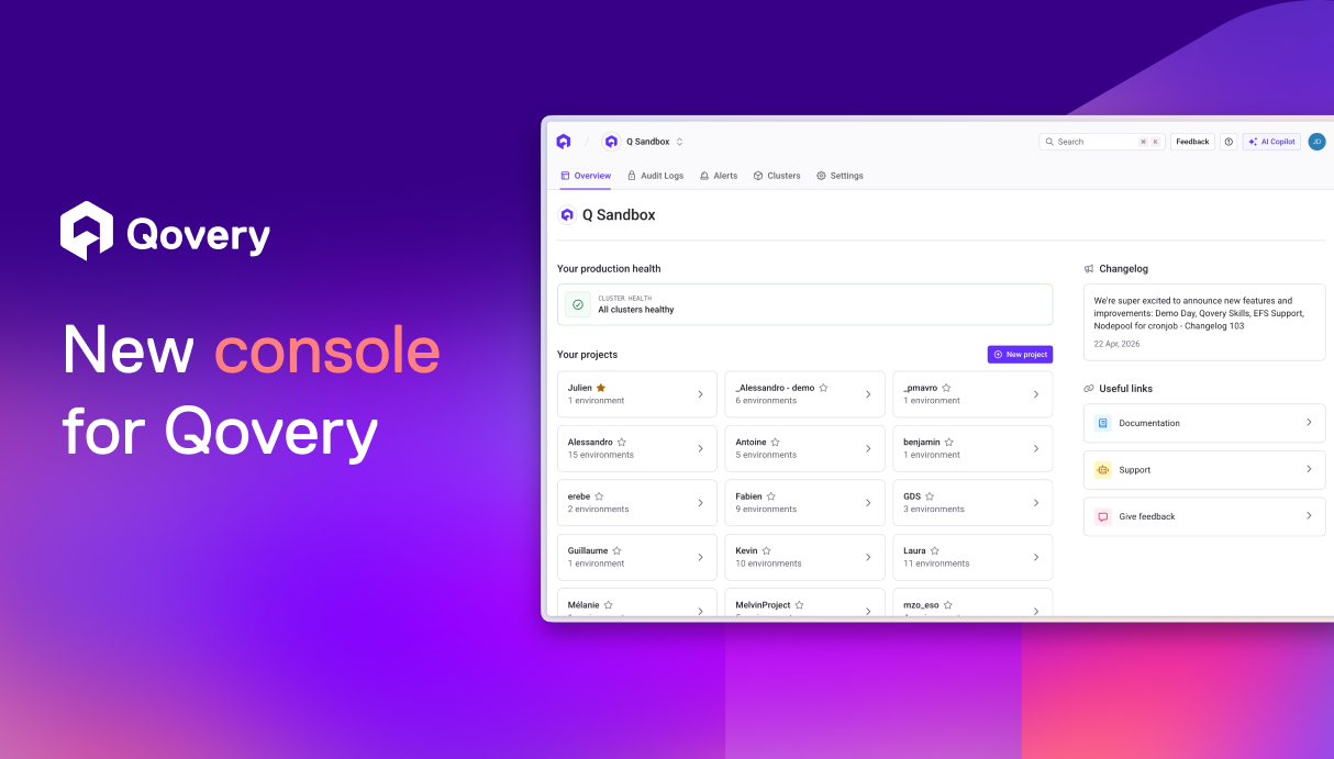
The biggest change is structural: we moved the navigation out of the sidebar and into the header, right below the breadcrumb. The tabs adapt to the current scope, which makes it much clearer what you can do at each level. It also gives us a lot more room to keep adding features down the line.
We also took the chance to better integrate parts of the experience that used to live in a slightly awkward "over the content" state, like the service logs and the cloud shell. They now sit inside the navigation, where they belong, instead of floating on top of it, which also gets rid of a lot of bugs and UI inconsistencies along the way.
Overviews at every level
Every page in the new console now opens on an overview, built around one simple question: what's happening right now? At the organization level, you see the state of production. At a project level, the state of its environments, and so on. Recent deployments and recent activity sit next to that status, so you can also tell what just happened.
The goal was to make every level of the platform immediately understandable without requiring users to navigate through multiple sections first.
The essentials are there as soon as you land. You can still dig deeper to investigate or take action, but you no longer have to click through several pages just to know if something is wrong.
A simpler token system, with dark mode included
We also took the opportunity to rebuild our Tailwind configuration and our color tokens from scratch. Our previous token system was over-engineered from the start, more complex than what our team and our product actually needed. We are a small team, and a lean, easy-to-understand token system fits our scale much better and lets us deliver faster.
It also unblocked dark mode. In the old console, parts like the logs and the cloud shell were not cleanly tokenized, which left them stuck in a fixed theme no matter what the rest of the UI did. A real light/dark switch was not possible until the token structure was redone.
We based the new system on the Radix Colors philosophy: a 12-step scale where each step has a clearly defined role, and where the same step plays the same role in light and dark mode. We customized it to fit our needs and our brand. The result is a system where each token has a clear purpose and where dark mode comes directly out of the same scale.
Technical Choices
Routing with TanStack Router
The previous version of the Console relied on an older react-router setup that no longer matched the architecture we wanted for the new Console. As the product grew in complexity, we wanted a more modern routing solution with stronger support for type safety, nested layouts, and data loading patterns.
As we evaluated alternatives to our existing routing approach, TanStack Router quickly stood out. Its TypeScript-first approach, nested routing model, and seamless integration with TanStack Query made it a strong fit for the architecture we wanted to build.
Seamless TanStack integration
We were already relying heavily on parts of the TanStack ecosystem across the Console, including TanStack Query and TanStack Table. Adopting TanStack Router felt like a natural continuation of that direction.
The integration between TanStack Query and TanStack Router is where the magic really happens: prefetching data, caching results, and streaming updates are all seamless, intuitive, and naturally fit the architecture we wanted to build.
End-to-end type safety
With react-router, our routes relied on manually maintained path constants describing the different URLs. That's now over thanks to TanStack Router's file-based routing, automatically generating typed routes for us.
TanStack Router is built TypeScript-first from the ground up. All features were engineered with fully inferred type safety in mind: no manual type assertions, no angle brackets to pass type parameters, and informative error messages when a path is invalid.
This drastically reduced the amount of manually maintained routing logic and helped catch invalid paths directly at compile time.
Powerful nested routing
TanStack Router's nested routing system makes it much easier to build nested layouts and model parent-child relationships across the application.
Compared to our previous react-router setup, this significantly simplified route composition and layout management. It also gave us the opportunity to move away from our old pages-based structure, which had become increasingly difficult to maintain as the Console grew and did not align well with the domain-driven approach encouraged by Nx.
Modern frontend tooling
As part of the Console redesign, we also took the opportunity to modernize parts of our frontend tooling by moving from Webpack to Vite.
TanStack Router integrates naturally with the Vite ecosystem and favors explicit, composable patterns, which aligned well with the architecture we wanted to build over time.
React Suspense and improved loading states
We decided it was time to rethink our data loading strategy as well, and rethink large parts of our loading patterns around Suspense.
React Suspense and TanStack Router actually complement each other very naturally.
TanStack Router's route loaders feed data into Suspense boundaries, giving you a clean separation between routing, data fetching, and loading UI.
Massive reduction in boilerplate
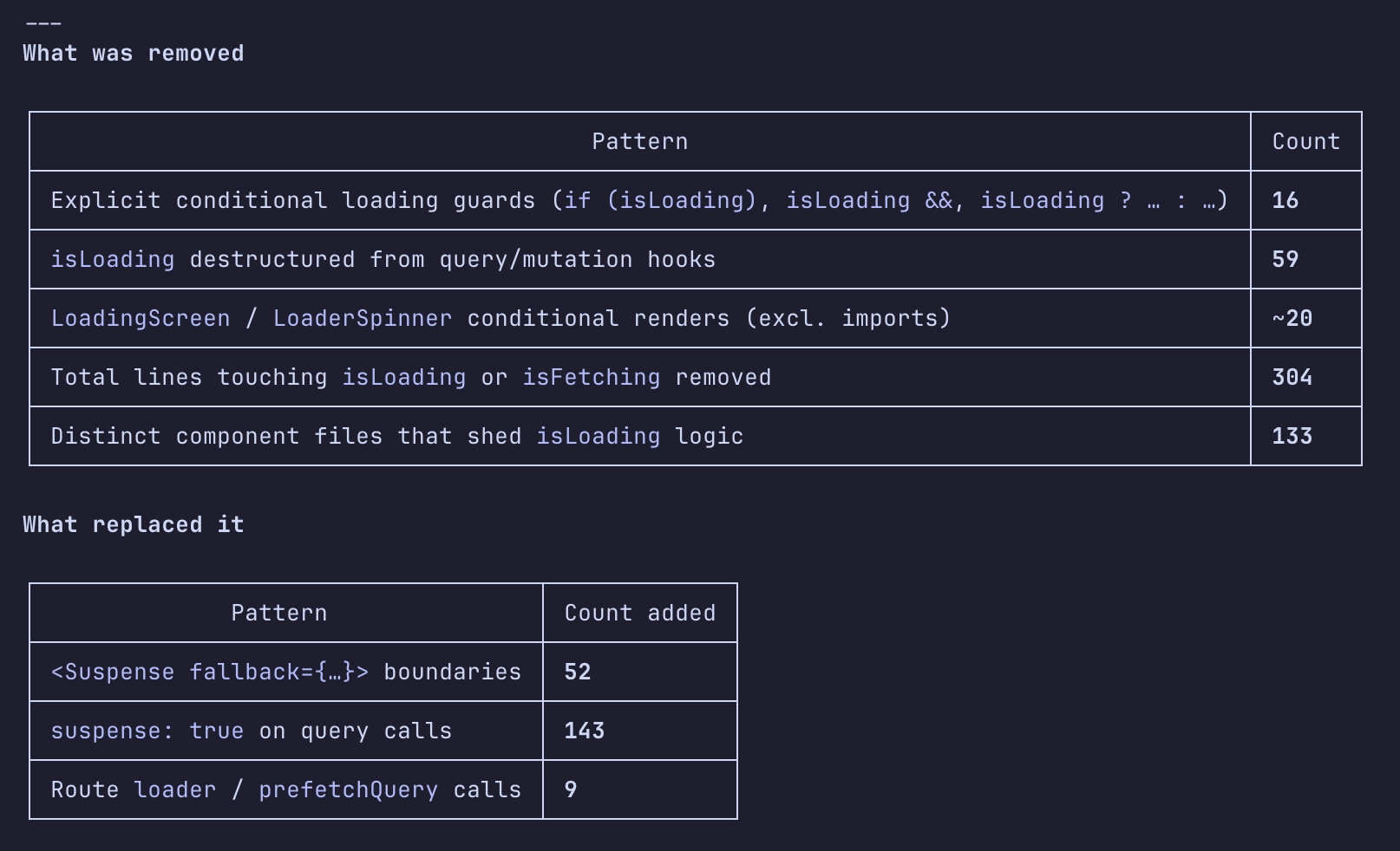
While our older loading patterns often relied on conditional rendering logic, Suspense eliminated this complexity by handling loading states declaratively.
That led us to ditch most of our waterfall of if loading, else render, which significantly improved the developer experience.
To put that into perspective, Suspense allowed us to replace 328 lines of conditional rendering logic with simplified Suspense boilerplate.
Better perceived performance
The Suspense component works through React's concurrent rendering system, which can pause and resume work as needed. Coupled with the benefits mentioned just above, this resulted in a smoother and more responsive overall experience.
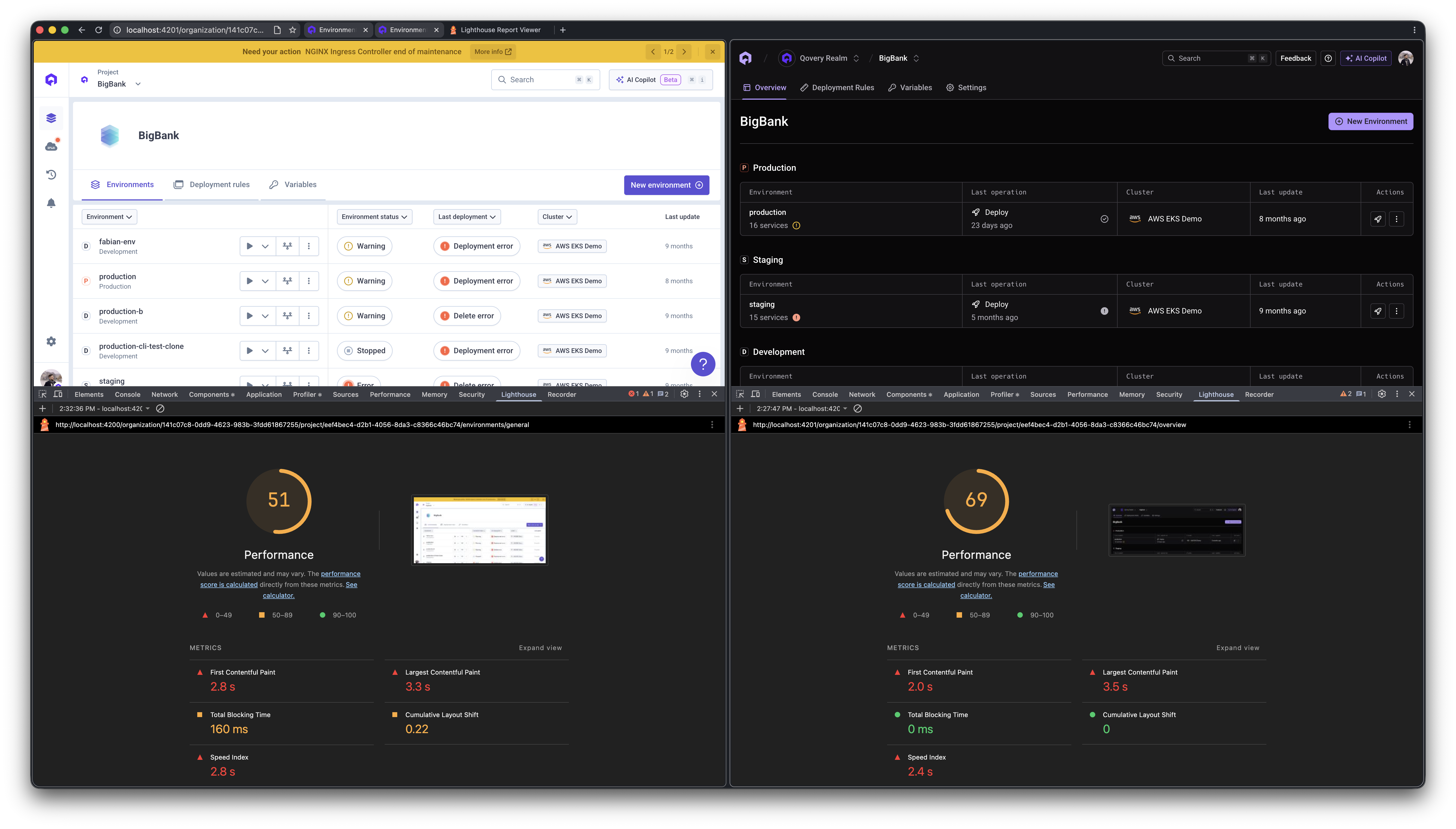
Benchmarking the previous and new versions of our Console, we observed noticeable improvements in FCP, Total Blocking Time, Speed Index, and Cumulative Layout Shift.
Experience the new Qovery Console.
Navigate your environments, deployments, and platform settings faster than ever with the redesigned Qovery Console.
From a technical perspective, this new version of our Console represents an architectural shift.
One of the biggest architectural changes was the removal of the entire libs/pages/ layer. The entire libs/pages/ layer was deleted (16 libraries, 666 files, ~49,661 lines). These libraries grouped most Console views and UI logic around page-level concerns rather than domain boundaries.
They were replaced by:
apps/console/src/: 171 new route files (~13,500 lines) following TanStack Router's file-based routing convention
Expanded libs/domains/: 343 new files (~59,000 lines added), absorbing logic that previously lived in libs/pages/ into dedicated domain libraries
Other things removed alongside: apps/console-e2e (Cypress E2E project), libs/domains/event (consolidated), libs/shared/toast (removed).
New libraries added: domains/audit-logs, domains/onboarding, domains/service-job, domains/service-settings, shared/webflow.
Overall, the migration helped us move toward a more domain-oriented and maintainable frontend architecture.
Results & Learnings
Since the redesign rolled out, we've already been receiving very positive feedback from users, especially around the new navigation and the overall consistency of the interface.
Throughout the rollout, we worked closely with beta testers and customers, collecting feedback directly from the Console via an in-product flow connected to Slack, so we could iterate quickly on navigation and key workflows.
This project also gave us the opportunity to improve many smaller workflows and interactions across the product by integrating feedback collected from users over time. Several workflows, components, and UI behaviors were refined to make the experience smoother and easier to use in everyday scenarios.
On the engineering side, the redesign helped us significantly improve the front-end foundations of the Console. Migrating to TanStack Router improved routing type safety and overall maintainability, while the new theming system and design tokens helped simplify the UI architecture and remove legacy patterns from the codebase.
This redesign is not a finished state, but a strong foundation for future improvements. It gives us a clearer structure to continue improving the developer experience and better highlight the different platform verticals and future platform capabilities.
As part of this effort, the Qovery Console is also open-source, allowing the community to explore, contribute to, and follow the evolution of the platform.
Thanks for reading this article. If you have any feedback about the redesign, feel free to reach out to us, we'd love to hear your thoughts and continue improving the experience!
Rémi is a staff frontend engineer at Qovery. He writes about frontend architecture, developer experience, and building scalable UI systems for platform engineering tools.
Théo is a senior product designer at Qovery. He shapes the visual and interaction design of the Qovery Console, with a focus on clarity, consistency, and developer-friendly UX.
Romain is a senior frontend engineer at Qovery. He works on the Console and writes about React, frontend tooling, and building performant web applications.
Next step
Experience the new Qovery Console.
Navigate your environments, deployments, and platform settings faster than ever with the redesigned Qovery Console.