Recently, I dedicated quite some time at Qovery to developing a technically challenging and complex feature: Logs Interface.
In this post, I'll explain how it works and share some design and front-end tips for efficiently rendering heavy resources in React - that also apply to other front-end stacks.
We have two types of application logs: Deployment and Running logs.
Both work similarly, though the Running logs contain more complex row structures and include advanced filtering options.
At Qovery, we help technical teams automate infrastructure and simplify deployments. Log analysis is an essential part of that workflow, giving developers clear insights to troubleshoot and improve their applications directly from the platform.
In this context, the main challenges are handling high volumes of logs with thousands of lines per session, managing performance bottlenecks, and ensuring the user experience supports these optimisations.
Rendering Strategy
Too many DOM nodes can cause browser freezes
The page can contain more than 10.000 lines - rendering them all at once can seriously impact performance. Here are two possible solutions:
Virtualization
This approach renders only the elements visible in the viewport. However, it struggles with variable-height content like multi-line logs. Libraries like virtua or @tanstack/virtual are commonly used.
CSS content-visibility
A property that lets the browser skip rendering elements until they are visible. It's performant but not ideal for long lists since everything stays in the DOM. You can learn more about it in this article.
Both approaches have limitations with variable-height content in our case, so we developed our own approach using these rendering optimizations:
Debounced rendering with WebSockets
Logs arrive one by one through a WebSocket. Instead of rendering every new log immediately, we update the DOM once per second. This reduces the number of renders.
Render only a subset of logs initially
On first load, we only render the last 500 logs. This avoids performance issues caused by rendering too many DOM nodes. Users can still load more logs if needed.
Using this approach, we achieve:
108ms (optimized) vs 1084ms (unoptimized)
That's a 90% reduction in rendering time
Memory usage and responsiveness see similar improvements.
You can try the demo here and use the performance console tool to see the difference.
Keep row elements simple and minimize redundant DOM elements
Try to keep each row as simple as possible by avoiding unnecessary wrappers or deeply nested elements. This helps reduce DOM size and improves rendering performance.
For example, here's how we optimized icon rendering in each row:
Use theuseelement to reference a shared SVG
This prevents repeating the same markup and reduces DOM complexity. See the example below.
Use font icons
They are lightweight and easy to style across the app.
To help users follow what's happening in the logs, we added small visual cues, similar to what you'd see in messaging apps like Slack.
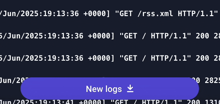
New logs indicator
When the user scrolls inside the log list, we pause the rendering of new logs. A button appears at the bottom to let them know that new logs are available and can be resumed when clicked.
null
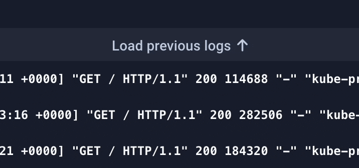
Previous logs indicator
Since we only render the last 500 logs by default, a button appears at the top of the list when the user scrolls up, allowing them to load previous logs if needed.
null
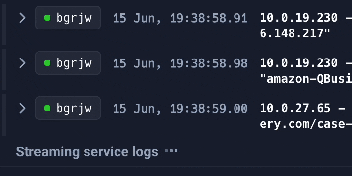
Local status indicator
We show whether logs are loading, streaming, paused, or finished. So users always know what's going on.
null
These visual indicators, combined with our rendering optimizations, create a comprehensive solution that balances performance with usability.
Agents ship fast. Guardrails keep them safe.
Qovery ensures every agent action is scoped, audited, and policy-checked. Start deploying in under 10 minutes.
These techniques have significantly improved our Logs Interface performance. The biggest wins came from design choices - deciding what not to render, rather than optimizing how we render everything.
We have some other optimizations in the pipeline, but this is a solid foundation.
Thanks for reading, and shoutout to my Qovery teammates who built this with me.
Don't hesitate to reach out if you have questions or want to see more about our product!