Blog
Engineering
Product
6
minutes

Adding Elegant Shadows with React to Invite Users to Scroll

By keeping your content in a box with a reasonably small height, you risk keeping hidden a part of your content. Users may not know that they can scroll down. How do you make sure they don't miss anything? At Qovery, we love to find elegant and subtle designs that encourage users to better use our product. In this article, I will explain how I added a Shadow effect to invite our users to scroll down content. Let's go!
Benjamin Debon
Software Engineer
Summary
Twitter icon
linkedin icon

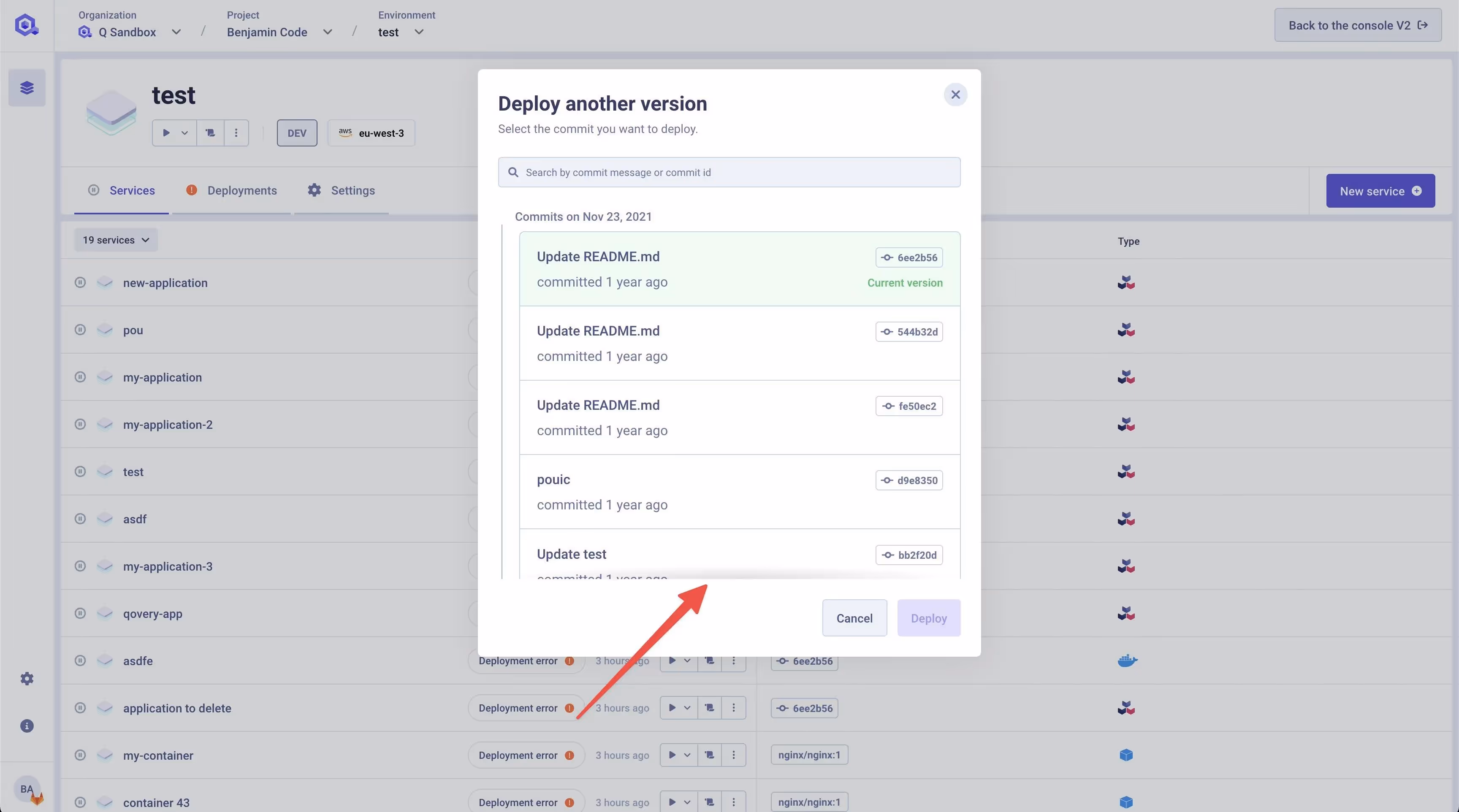
Before we start, let's quickly illustrate what we are talking about. Yes, this is what you see below. A simple shadow effect 🙂. (It's more complex than what it looks like - keep reading).

Here is the light shadow we add on our boxes to reveal a scrolling possibility

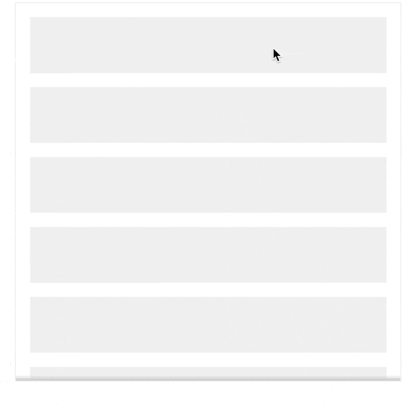
The thing is that adding this shadow can be a little bit tricky because you want it to be here at the beginning. Then if you scroll, you want to have it on top and bottom. And if you reach the bottom, you want to hide the bottom shadow.

After implementing it the first time with a bad developer experience on our v2, we have decided to redo it from scratch on our React v3.

In this article, you will learn how to do it and what we added to the common implementation you usually find everywhere on google.

Scroll effect

A First Glimpse Into the Developer Experience

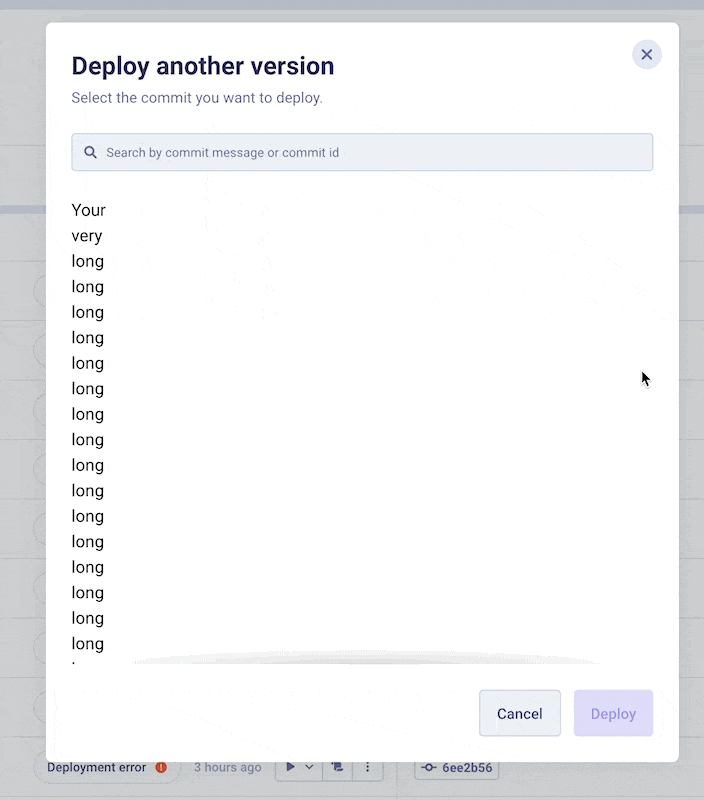
At the end of this article, you should have been able to use this component as quickly as this:


  • Your

  • Very

  • long

  • long

  • long

  • long

  • long

  • long

  • long

  • long

  • content


Scroll down and Up with shadow effect

You have to wrap your content with the "<ScrollShadowWrapper>", giving it a max height; that’s it!

What our Implementation Improves Compared to the One we Found Anywhere Else

Shout out to Marius Ibsen, that created a pretty elegant way to detect when we need the top and the bottom shadow. He documented that in his medium article.

The problem with his implementation is not in the detection but in the shadow itself. His shadows are done with "box-shadow inset", and the problem with the box shadows is that they are pretty ugly, and you don’t have any control over them.

null

So instead of using a hook as he does, we use a WrapperComponent to embed all the improvements we want. And our improvements are on the count of 2.

One is about the shadows, but another, which we will cover a little bit later, provides an auto re-computation of the shadow presence when the content evolves. If the content gets bigger for any reason (async loading, filtering, …), the shadow presence must be re-asserted.

Our Own Beautiful Shadows

To implement the shadows, we used two div that stick to the top and the bottom of the wrapper with the "sticky" CSS property.

      ref={wrapperRef}
style={style}
className={`relative overflow-auto ${className}`}
onScroll={onScrollHandler}
>
{/* SHADOW TOP */}
className={`sticky top-0 bg-scroll-shadow-up w-full h-4 -mb-4 transition-opacity duration-300 ${
getVisibleSides().top ? 'opacity-100' : 'opacity-0'
}`}
/>

{children}

{/* SHADOW BOTTOM */}
className={`sticky bottom-0 bg-scroll-shadow-bottom w-full h-4 -mt-4 rotate-180 transition-opacity duration-300 ${
getVisibleSides().bottom ? 'opacity-100' : 'opacity-0'
}`}
/>

We use Tailwind in our example, but you can use whatever you want for your own implementation. As long as you set your blocks as "sticky" and, respectively "top-0" and "bottom-0"

Another trick to keep the shadows on top of the content

By default, sticky keeps your block in the flow, so if your shadow is 16px tall, it will add 16px on top of your content, and you won’t have the desired effect; your shadow will be floating in the middle of nowhere instead of being on top of the content.

Shadow represented in a red floating way above the content because sticky keeps the shadow in the flow

What you want to do, is to remove the size of the shadow from the flow, you want the shadow, to be on top of your content

Shadow in red, passing on your content
Shadow as a shadow so you can see the final effect

For this trick, you need to add a negative bottom margin to the shadow of the top and a negative top margin to the shadow of the bottom.

Example of sticky block stacked to the top but removed from the flow with a height of 16px and negative margin-bottom of 16px

With that, you should be able to place your shadows correctly and give them the design you want.

Activating the Shadow

To compute if your component must show the top shadow, the bottom one, or both at the same time, we re-used the technic of Marius because it was working super well (kudos to you).

export function ScrollShadowWrapper(props: ScrollShadowWrapperProps) {
const { children, className = '', style = {} } = props

const [scrollTop, setScrollTop] = useState(0)
const [scrollHeight, setScrollHeight] = useState(0)
const [clientHeight, setClientHeight] = useState(0)

const onScrollHandler = (event: React.WheelEvent) => {
setScrollTop(event.currentTarget.scrollTop)
setScrollHeight(event.currentTarget.scrollHeight)
setClientHeight(event.currentTarget.clientHeight)
}

const wrapperRef = useRef(null)

const getVisibleSides = (): { top: boolean; bottom: boolean } => {
const isBottom = clientHeight === scrollHeight - scrollTop
const isTop = scrollTop === 0
const isBetween = scrollTop > 0 && clientHeight < scrollHeight - scrollTop

return {
top: (isBottom || isBetween) && !(isTop && isBottom),
bottom: (isTop || isBetween) && !(isTop && isBottom),
}
}

return (
ref={wrapperRef}
style={style}
className={`relative overflow-auto ${className}`}
onScroll={onScrollHandler}
>
{/*SHADOW TOP*/}
className={`sticky top-0 h-4 -mb-4 bg-scroll-shadow-up w-full transition-opacity duration-300 ${
getVisibleSides().top || true ? 'opacity-100' : 'opacity-0'
}`}
/>
{children}
className={`sticky bottom-0 bg-scroll-shadow-bottom w-full h-4 -mt-4 rotate-180 transition-opacity duration-300 ${
getVisibleSides().bottom || true ? 'opacity-100' : 'opacity-0'
}`}
/>

)
}

export default ScrollShadowWrapper

You listen to the scroll of your component and handle bit by the "onScrollHandler" function that saves the last scroll position and information about the scrollbar.

As it sets values via "useState", the component is being rendered, so the "getVisibleSides()" function is triggered again and says if yes or not, you have to show the top and bottom shadow.

That’s pretty much it.

But as I told you earlier, this won’t update the shadow visibility if your content height updates.

null

Fixing the Shadow if Content Evolves

The logic here is simple when the content height evolved, the height of our wrapper evolved. Still, no scroll events were triggered, so we are not recomputing anything, and the shadow stays in the state it was, even though we potentially don’t need it anymore.

We can easily fix that by resetting the values to the current one every time its height evolves.

This time, we can’t get the component through "event.currentTarget" because there is no event. This is why we have to use a ref.

const wrapperRef = useRef(null)

useEffect(() => {
const resetRefSizes = (ref: RefObject) => {
if (!ref.current) return

setScrollTop(ref.current.scrollTop)
setScrollHeight(ref.current.scrollHeight)
setClientHeight(ref.current.clientHeight)
}

resetRefSizes(wrapperRef)
}, [wrapperRef?.current?.clientHeight])

With that done, you are ready to go!

null

Conclusion and Source Code

At Qovery, we love building our new interface in public. Our repository is open-source. You may then access our implementation and see the full source code here. You can also see how we implemented the unit tests for this not-quite-conventional thing to test.

We hope it will help you to reproduce this kind of neat effect on your product, and if many of you request it in the issues of our repository, we will maybe make an npm package for this component so that all of you can enjoy it even more efficiently.

Share on :
Twitter icon
linkedin icon
Ready to rethink the way you do DevOps?
Qovery is a DevOps automation platform that enables organizations to deliver faster and focus on creating great products.
Book a demo

Suggested articles

Cloud
Heroku
Internal Developer Platform
Platform Engineering
9
 minutes
The Top 8 Platform as a Service (Paas) Tools in 2026

Build Your Own PaaS: Stop depending on fixed cloud offerings. Discover the top 8 tools, including Qovery, Dokku, and Cloud Foundry, that let you build a customizable, low-maintenance PaaS on your cloud infrastructure.

Morgan Perry
Co-founder
Kubernetes
 minutes
How to Deploy a Docker Container on Kubernetes: Step-by-Step Guide

Simplify Kubernetes Deployment. Learn the difficult 6-step manual process for deploying Docker containers to Kubernetes, the friction of YAML and kubectl, and how platform tools like Qovery automate the entire workflow.

Mélanie Dallé
Senior Marketing Manager
Observability
DevOps
 minutes
Observability in DevOps: What is it, Observe vs. Monitoring, Benefits

Observability in DevOps: Diagnose system failures faster. Learn how true observability differs from traditional monitoring. End context-switching, reduce MTTR, and resolve unforeseen issues quickly.

Mélanie Dallé
Senior Marketing Manager
DevOps
Cloud
8
 minutes
6 Best Practices to Automate DevSecOps in Days, Not Months

Integrate security seamlessly into your CI/CD pipeline. Learn the 6 best DevSecOps practices—from Policy as Code to continuous monitoring—and see how Qovery automates compliance and protection without slowing development.

Morgan Perry
Co-founder
Heroku
15
 minutes
Heroku Alternatives: The 10 Best Competitor Platforms

Fed up of rising Heroku costs and frequent outages? This guide compares the top 10 Heroku alternatives and competitors based on features, pricing, pros, and cons—helping developers and tech leaders choose the right PaaS.

Mélanie Dallé
Senior Marketing Manager
Product
Infrastructure Management
Deployment
 minutes
Stop tool sprawl - Welcome to Terraform/OpenTofu support

Provisioning cloud resources shouldn’t require a second stack of tools. With Qovery’s new Terraform and OpenTofu support, you can now define and deploy your infrastructure right alongside your applications. Declaratively, securely, and in one place. No external runners. No glue code. No tool sprawl.

Alessandro Carrano
Head of Product
AI
DevOps
 minutes
Integrating Agentic AI into Your DevOps Workflow

Eliminate non-coding toil with Qovery’s AI DevOps Agent. Discover how shifting from static automation to specialized DevOps AI agents optimizes FinOps, security, and infrastructure management.

Mélanie Dallé
Senior Marketing Manager
DevOps
 minutes
Top 10 Flux CD Alternatives: Finding a Better Way to Deploy Your Code

Looking for a Flux CD alternative? Discover why Qovery stands out as the #1 choice. Compare features, pros, and cons of the top 10 platforms to simplify your deployment strategy and empower your team.

Mélanie Dallé
Senior Marketing Manager

It’s time to rethink
the way you do DevOps

Say goodbye to DevOps overhead. Qovery makes infrastructure effortless, giving you full control without the trouble.